Hamish Ingham
Bold lashes of flavour.
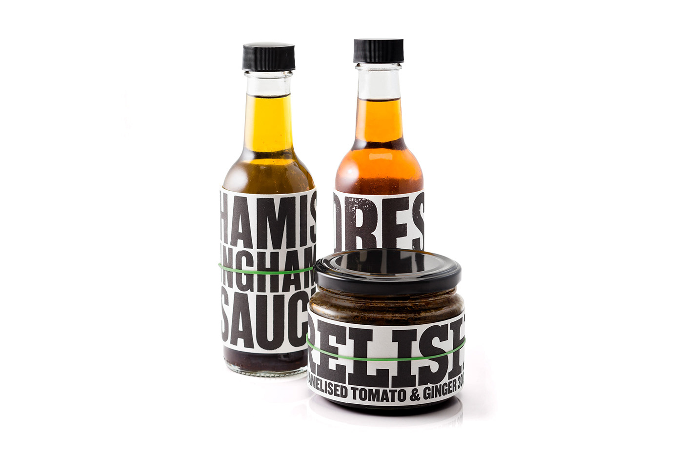
When Sydney chef Hamish Ingham asked us to design a range of gourmet sauces and relishes, we knew that every bottle needed to be loaded with 'the true flavours of Hamish'.
The simple solution brings together Hamish’s edgy and confident character, the honesty of the ingredients, and references the décor of his flagship restaurant —Bar H.
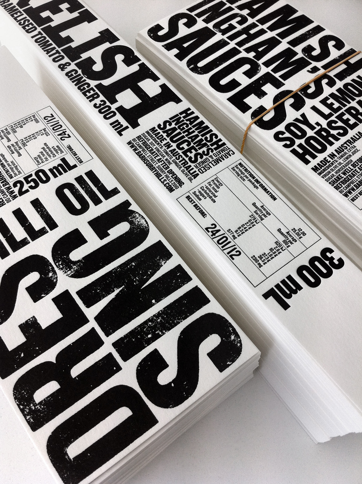
Bold monochromatic letterpress type on weighty, textured paper gives intrigue and substance. Labels are held in place with a bright green rubber band. It contrasts strongly with the black and white label, adding a quirky point of difference. A neat economical replacement for an adhesive.
Bold monochromatic letterpress type on weighty, textured paper gives intrigue and substance. Labels are held in place with a bright green rubber band. It contrasts strongly with the black and white label, adding a quirky point of difference. A neat economical replacement for an adhesive.


Work with us
At Frost*collective, we’re all about designing a better world. We’ve been operating independently for over 25 years, working with inspiring brands and organisations across the globe. We combine specialist skills in brand, environments and place to solve complex business challenges and design experiences that enrich lives. If you'd like to work with us, get in touch.


